A New Tradition

Lundie Media Designed QPSA Logo Featured on Captain’s Armband
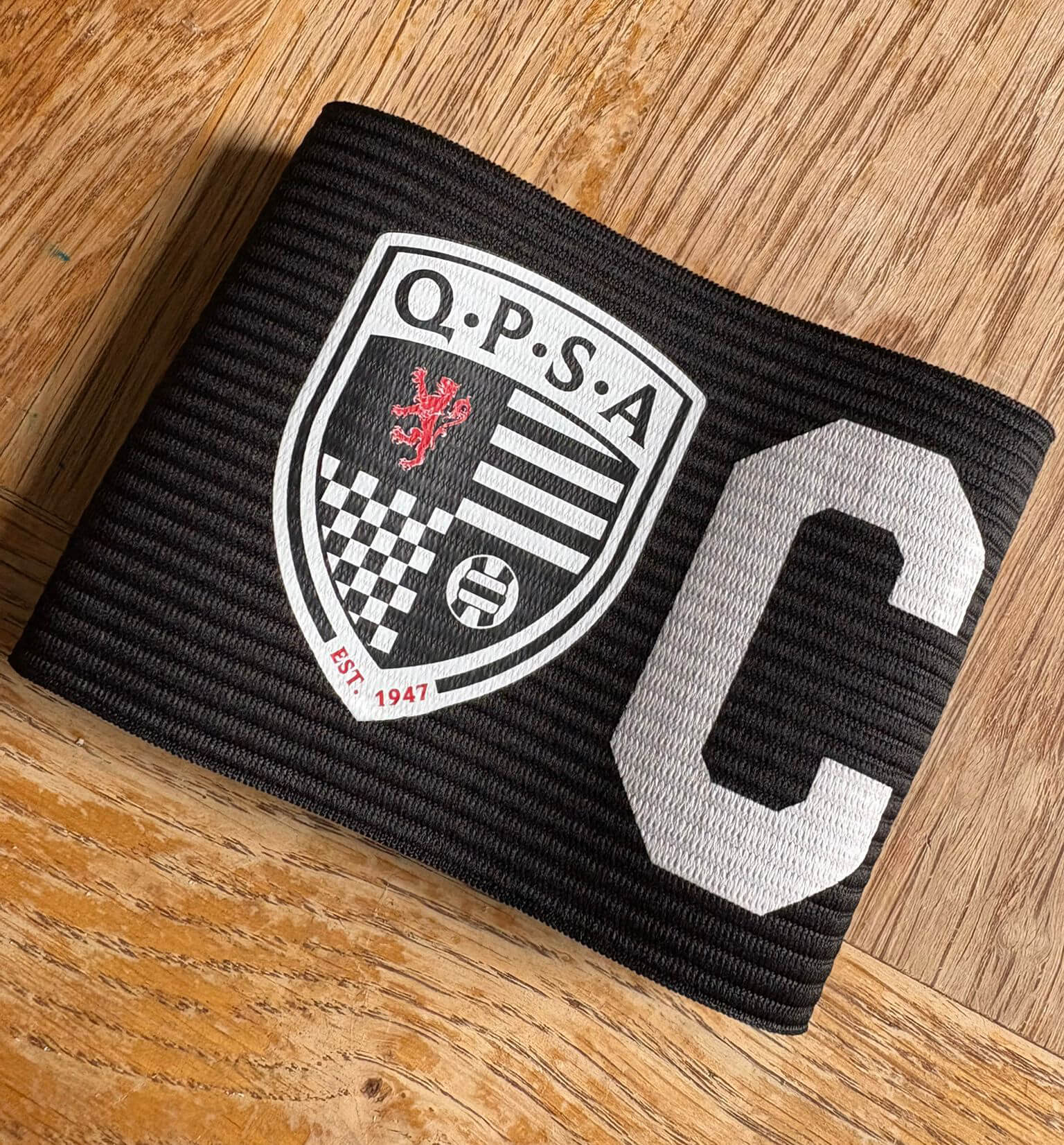
In a move that strengthens the bond between the club and its loyal fanbase, Queen’s Park FC has announced a new initiative featuring a special captain’s armband for the 2025-26 season. Designed in collaboration with the Queen’s Park Supporters Association (QPSA), the armband proudly displays the QPSA’s newly updated logo—a design we at Lundie Media were thrilled to create.
Starting with the home opener against Arbroath on Saturday, captain Euan Murray (or vice-captain Charlie Fox) will wear the new armband every matchday. But the story doesn’t end at the final whistle. In a heart warming new tradition, the captain will gift the armband to a young supporter after each home game, making the connection between player and fan more tangible than ever.
The new shield-shaped emblem draws inspiration from the QPSA’s rich history, nodding to the group’s original 1947 logo and motifs from the 1970s. The design integrates classic elements like the iconic lion, football, and hoops, while introducing a chequerboard pattern that pays tribute to the historic ska influence within the support. The resulting logo is a modern tribute to the group’s legacy and a powerful symbol of their continued commitment.
“We’re delighted to be supporting the club in this initiative and feature our new logo on the captain’s armband this season,” said Richard Baillie from the QPSA. “The design builds on elements from the original 1947 logo and a version that was created when the QPSA was rebooted around 50 years ago. It keeps our iconic lion, football and the hoops, and brings in the chequerboard which is a nod to the historic ska influence in the support. Thanks to Lundie Media for their design input and I, as do all at the QPSA, look forward to seeing it in action this Saturday.”
This project is a perfect example of how strategic logo design and branding can help an organisation strengthen its message and reinforce its identity. A well-crafted logo is more than just a graphic; it’s the visual heart of a brand, telling its story and fostering an emotional connection with its audience. By honouring the QPSA’s history while looking to the future, this new emblem clearly communicates the passion and heritage of the supporters.
As a Glasgow-based design agency, we understand the power of a strong brand identity. We have had the privilege of working on branding projects for a diverse range of clients, from major sports teams and global charities to distinctive whisky brands and vital local businesses. Our goal in every project is to create a visual identity that is not only memorable but also deeply rooted in the brand’s core values.
If you are considering rebranding for your business and are looking for a local design agency with real values and a history of 15 plus years in the industry, get in touch today.

